
Monthly Archives: April 2013
music magazine evaluation – Alt-Mag
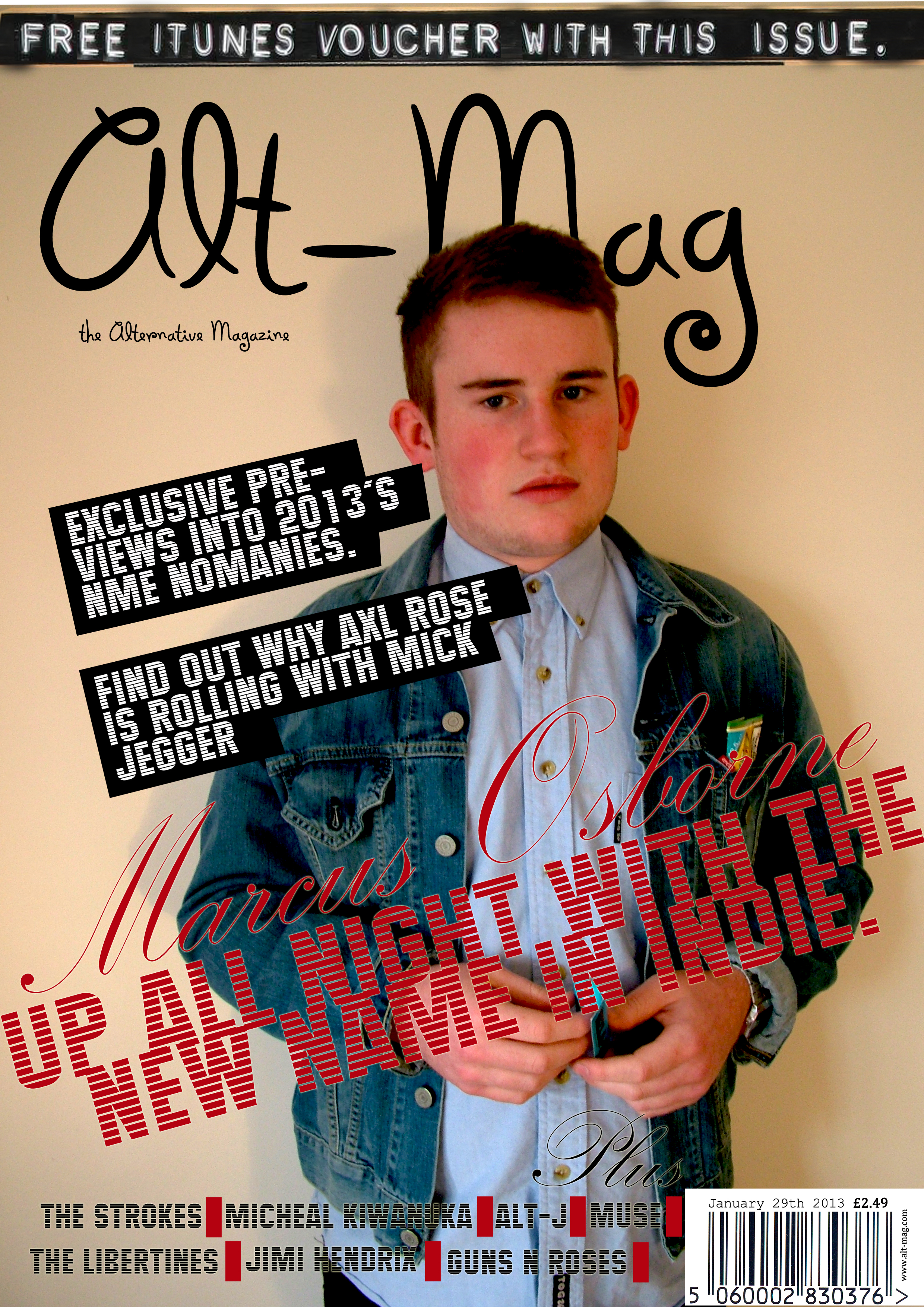
The genre of my magazine is indie/alternative rock. The main article (the double page spread) Is an interview with a young solo artist looking for a comeback after a long break. All of the articles on the contents page are play on words and are all relevant to the artist they talk about. The tone and register of the magazine is quite informal and said how it is, this is because I wanted to write the interview how the artist would say it, without any journalistic editing, to add more of a personal touch to it, and get the artists personality across to the reader. My intentions were to create a magazine that focuses on the genre of rock, I also wanted to create a magazine that gave insight into the artist as in my pre-production survey, a lot of people voted ‘yes’, they would like to read about the private and bust lives of their favourite artist. And this is why I decided to make an interview as my double page spread. My magazines ethos is quite rude, it will talk about new bands in both good ways and bad ways. If a band is rubbish then I would write about the band being rubbish.
For the design and ideas of my magazine I did a lot of research into NME and Q magazine, this is because these were the two magazines most similar to how I would like my magazine to be like.


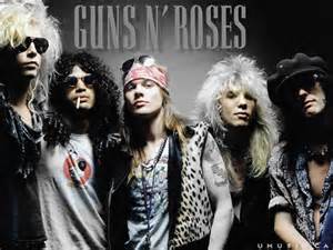
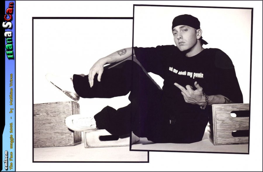
You can clearly see the difference between my magazine, a rock/indie genre, compared to that of a hip hop magazine. The codes and conventions are completely different; also the style and clothes are much different. The gun although linking to the article, is a clear representation of gangs and crime, a stereo typical statement of the sort of people this music has a heavy influence on. Also this is clearly a staged image taken in a studio, which is much different to the images taken of rock bands. Even the font is a strong representation of the genre as it looks as if it has been broken up and comes across as quite an aggressive font, also influenced by the specifically selected shade of red which is also aggressive.
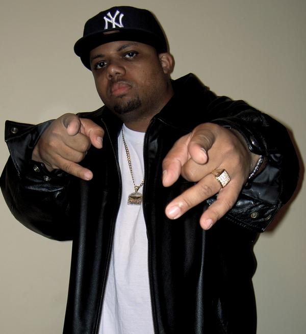
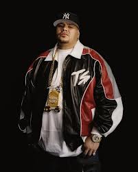
Here are some images to show the distict difference between the natural images taken of rock bands and the studio images of Hip-Hop artists.

From these two images you can clearly see how the two very different genres of music try to sell themselves. Rock is alot more about the music, of course there is an element of image in there, but no way near as much as that of a Hip-Hop artist. ACDC (on the left) are a rock band and they have an imgae of themselves playing on stage, with their band logo across the top, this is a very typical image to see of a Rock band when they are promoting themselves. However on the right there is the Hip-Hop image and you can clearly see that this is totally image based and no sign of music at all. This is a studio image therefore they have included a number of props, one of which being the money note in the artists hand. Money and the Dollar sign ($) has become a massive craze in the Hip-Hop industry, and have now become a representation of Hip-Hop and rap. The artist only care about looking cool and showing off their wealth and that is the main reason for the presence of the money in this image. The artist is also clearly trying to show off the watch aroung his wrist, this is again to represent his wealth.
These are some videos of the kind of music that my target audience would listen to.
In comparison, here are some music videos showing artists my target audience would not listen to. see how they are alot about the artist trying to impress and look good in comparison to the rock/indie videos which are alot more story line based.
I love the composition of the covers produced by both of these massive companies; they are always very distinctive and individual. The photography on covers are more often than not on a location as a pose to in a studio.


This is what I would expect and it is very typical of a rock magazine. However sometimes there is photography on the covers that have been taken in studios, these can actually be really effective and this is what I moved more towards for my photography.

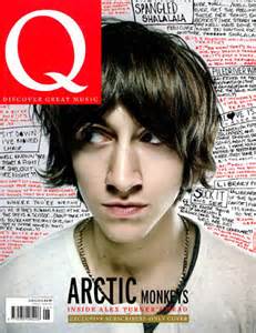
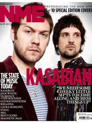
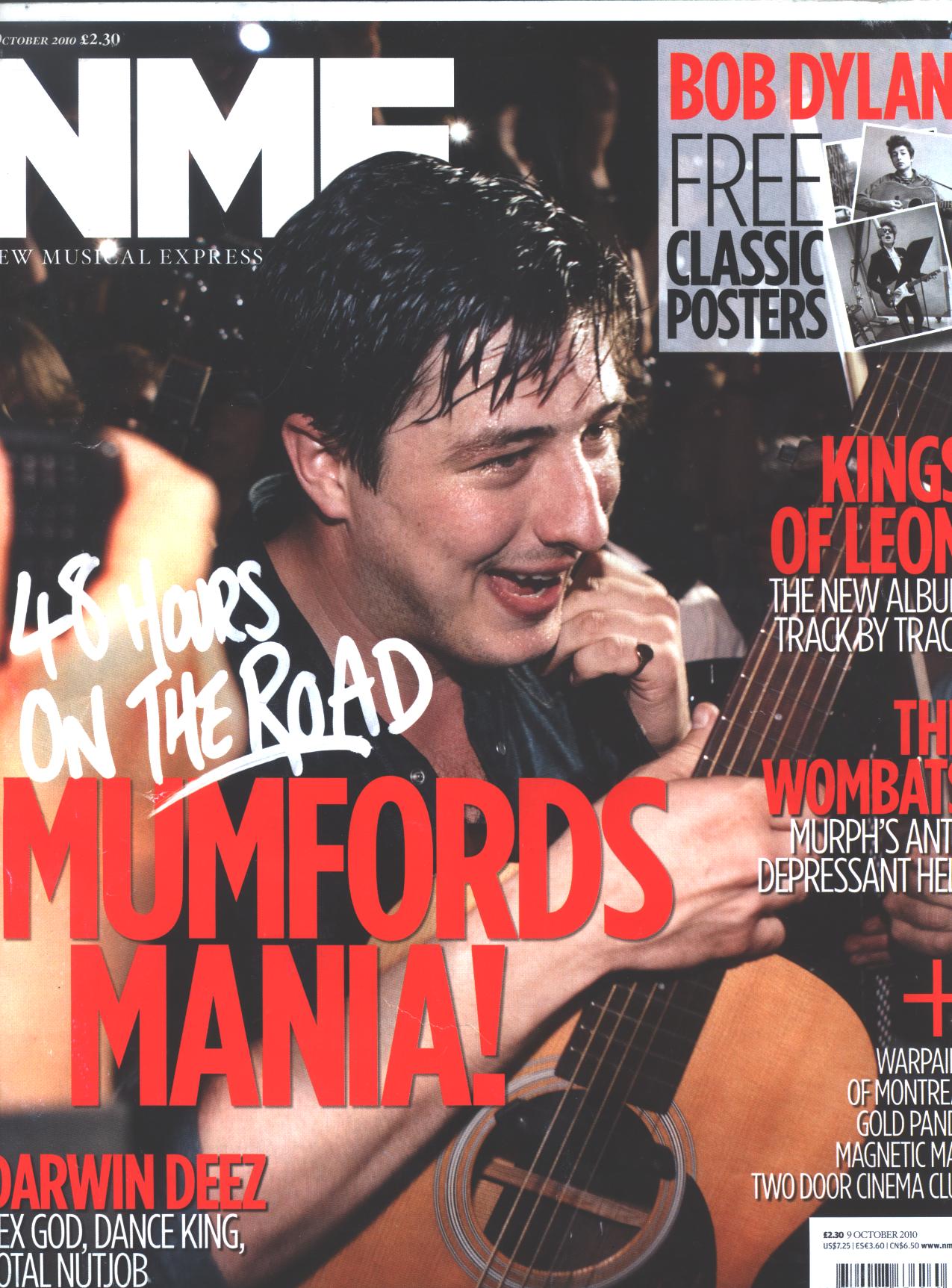
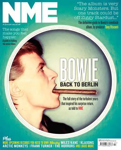
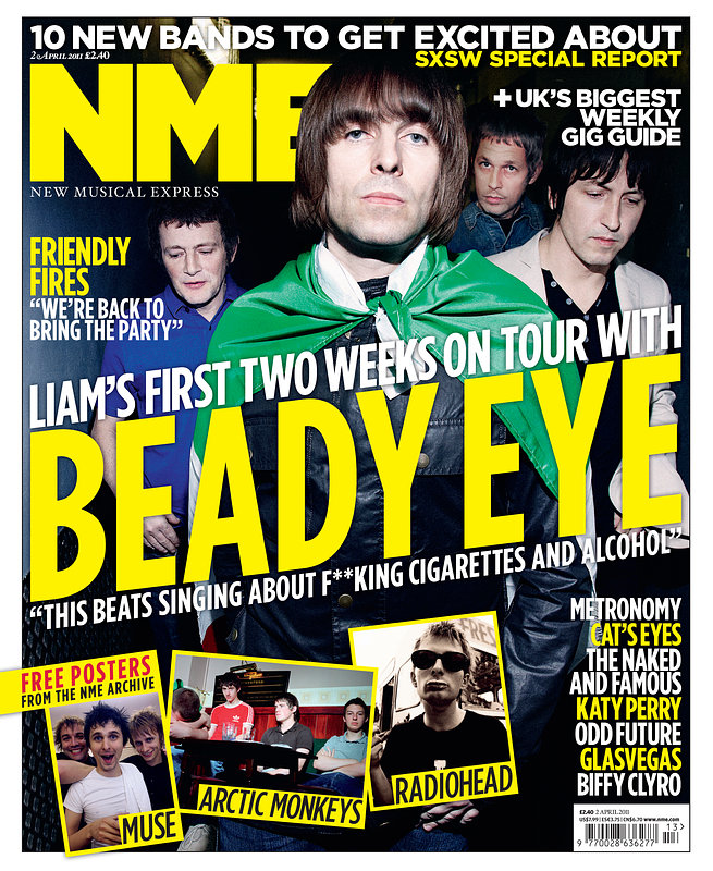
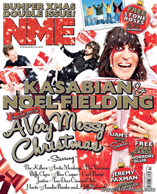
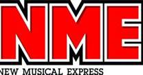
In the end it was NME magazine that I mainly focused on because I preferred its tone and I felt I could relate to it more than Q magazine, which has more of a journalistic tone to it. I particularly liked the designs of the NME magazines; I think they have a very unique and individual design. I really like the fonts they use; they tend to be quite bold and make a statement, but also are a good representation of the artist on the cover. They also use their fonts consistently, and they never use too many, using the same fonts throughout their magazines so it is more recognisable as an NME magazine. The imagery on the covers of NME magazines is always very interesting, and not too serious. It’s not too serious because for the majority of the time they take their images of the artists in more natural locations and not in studios. Their grid does tent to vary with each artist, if the image is of a less rebellious and not really an indie singer then the grid will tend to be more conventional, but it the image was of someone like Axl rose or Slash (rock stars), then the grid would most likely be unconventional. I like this because it gives you an idea of what the artists character is like just from the cover, before you have even read the article.
When analysing the NME and Q magazine covers, I could tell that they were much different and each had their own unique style that is easily recognised as theirs, known as house style. This is through the fonts used and general composition of them.

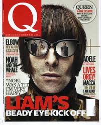
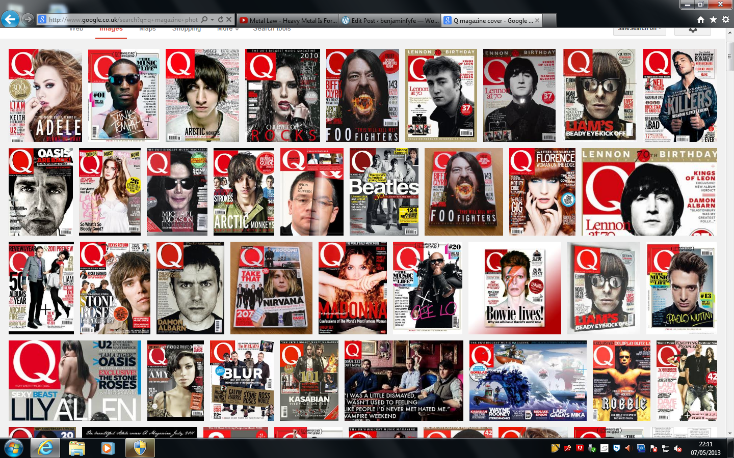
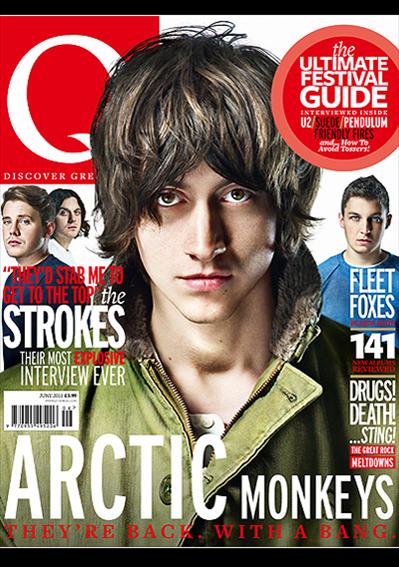
Q magazine have many close up images on their covers, and have a very professional photography style to them. when i typed in Qmagazine cover, this is what appeared (screen shot above).


Even without the masthead you can tell that these magazines are NME and Q, especially the NME magazine, this is a very typical NME magazine. The imagery is much different, NME magazines have the artist in natural locations as a pose the Q magazine, that more often than not has their images taken in studios. They both have their own writing styles, Q magazine taking a higher level of journalistic approach, and NME relating more to a young adult audience, with a more informal tone and register. As it is a more formal magazine and aims for a slightly older audience, Q magazine tend to keep their covers conventional and neat. This is because a mature reader would not be interested in all the different fonts filling a page in different sizes because that would be quite unconventional and targeted at a younger audience who would be more rebellious and want that unconventional feel. But to an older audience an unconventional magazine would just look immature and not worth reading. Therefore if you were aiming your magazine at an older, more mature audience you should make sure the cover isn’t to overcrowded, kept conventional and neat, and limit the amount of colours and fonts on the page. Whereas NME regularly have very unconventional covers, this is because they are aimed at a younger audience who like rock and are at a more rebellious age, therefore find the unconventional covers more appealing.
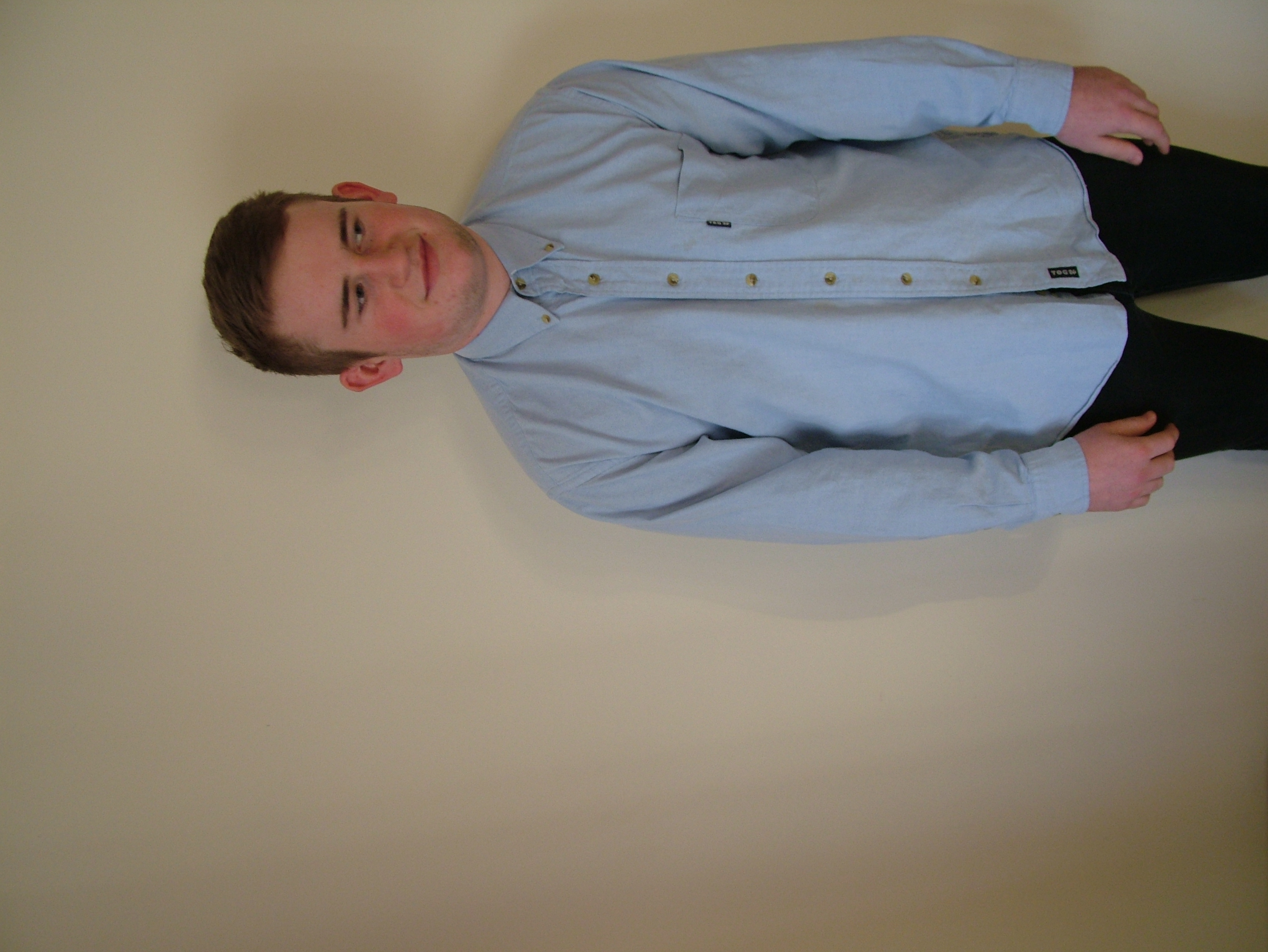
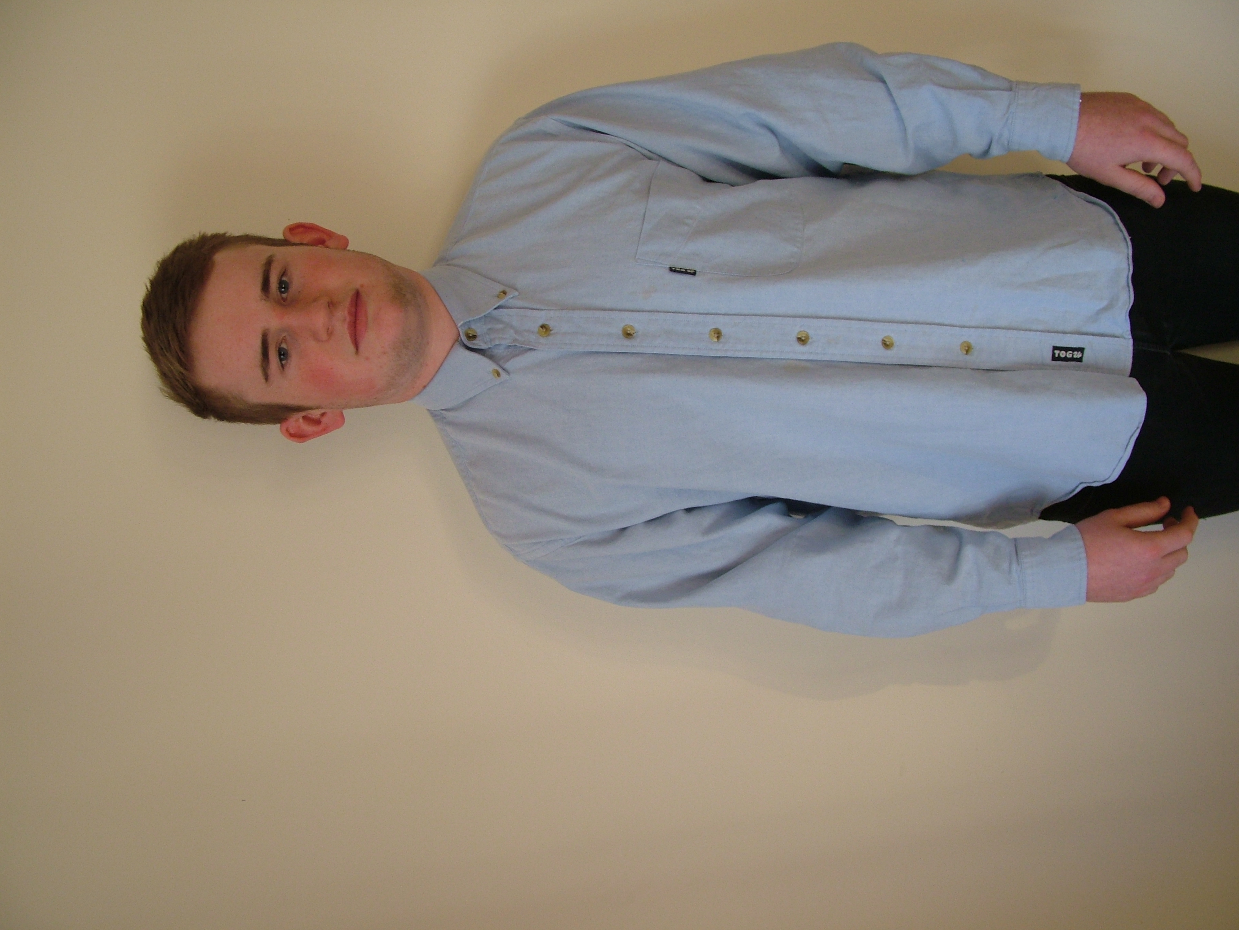
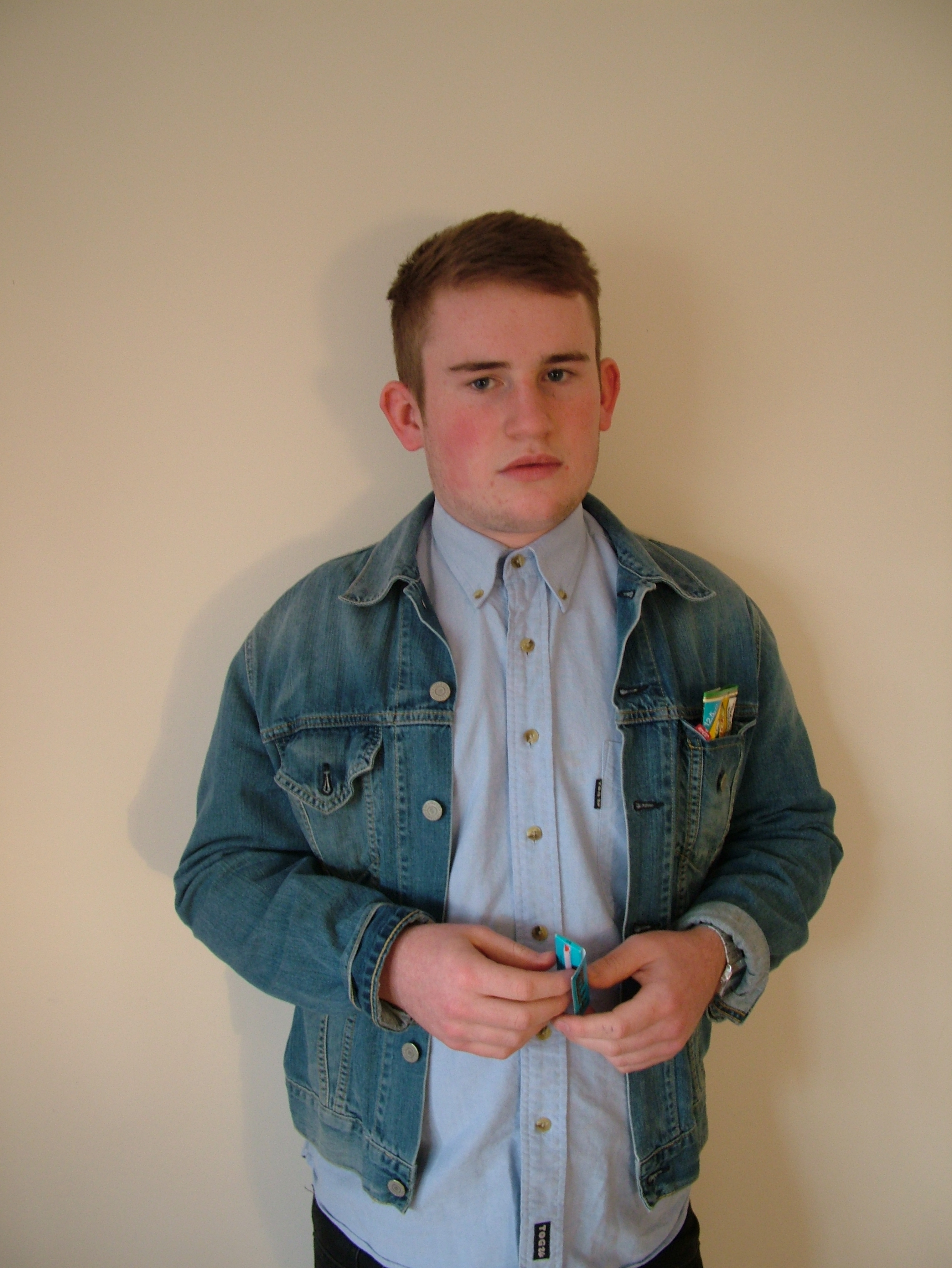
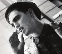
For my photography I decided to take more of a studio approach as a pose to a location image. This is because I had taken some location images as well as the studio images and decided that the studio images just looked more professional with the design and layout of my cover. The image of the artist is quite a strong representation of the kind of people who would buy this magazine, because the clothes I have made him wear is the kind of style I would expect from my target audience. Also the serious face suggests the general attitude of not only the tone and register of the magazine, but the attitude of the people who would read this magazine. Further, a representation of a Rock target audience. The rolling papers and the tobacco in the front pocket of the artist’s jacket again suggests the target audience would be interested in this kind of lifestyle. Also with the tobacco in the front pocket of his jacket, suggests that he is quite rebellious as he is not trying to hide it, he purposely has it on show, and this expresses his attitude and again the attitude to expect from my target audience.
Magazines such as NME and Q magazine tend to offer things like CDs and posters for their promotions. This is because they know their target audience will be interested in these kinds of things. This is mainly because people who are interested in rock music will mostly have CD players and therefore will be interested in a CDs, this is because they will not be expected to have new technology that would be expected from younger audiences. Despite NME is directed at a younger audience, it is not what their younger target audience would have. It is quite indie and classic to have a cd or even record player, and this is what a rock target audience would expect to have.
After having looked at Q magazine and really liking the red colour they heavily use on their covers, I knew that I wanted to interpret it into my magazine. Also the colour red has a resemblance of aggression, something that rock fans are heavily interested in. Not to say this is the reason why Q magazine have used the colour red, in this case Q magazine have used the colour red to represent their passion and excitement for music. Colours are really important to a magazine and especially for the cover. This is because the cover of the magazine is the first thing you see when looking at it on a shelf. If the colours are dark and gloomy them you can guess that it is either going to be a metal magazine or some kind of gothic/emo magazine. But if the colours are bright and joyful then it will most likely be a pop magazine. So the colours are very important as they can be a major factor when aiming your magazine at a particular target audience. Furthermore Q magazine uses red not only for passion and excitement, but also to attract the audiences eye and demands to be looked at, says stop and look, were an exciting and passionate magazine. This closely links to the style of Q magazine as it is quite a fun and exciting magazine yet still very adoring towards its goal, being a good music magazine. I also used a lot of the colour black; this is because I knew it would be a safe colour to use, and I also didn’t want there to be too many bright colours on the page because that is not what my target audience would be interested. Black and red go very well together and have quite a hard tone when together, this is a representation of my artist, as I wanted him to be quite a hard character. Also my magazine is masculine in tone, I aimed to make it serious in tone but at the same time stylish with the artists clothes in the photography. Also I have used a rather limited palette, this expresses the sophistication of design, as I have not over used colours and made it too much of an eye sore. Multicolour can appear to be quite immature and unsophisticated, it can make the design seem as if no effort has gone it to colour selection and target Audience research, especially if it is a rock magazine like mine. However if the magazine was directed at hippies then multi-coloured text or imagery could be used. So all in all I have selected these colours because it suggests that the magazine is unique and demonstrates a heavy ethos of design in the house style.
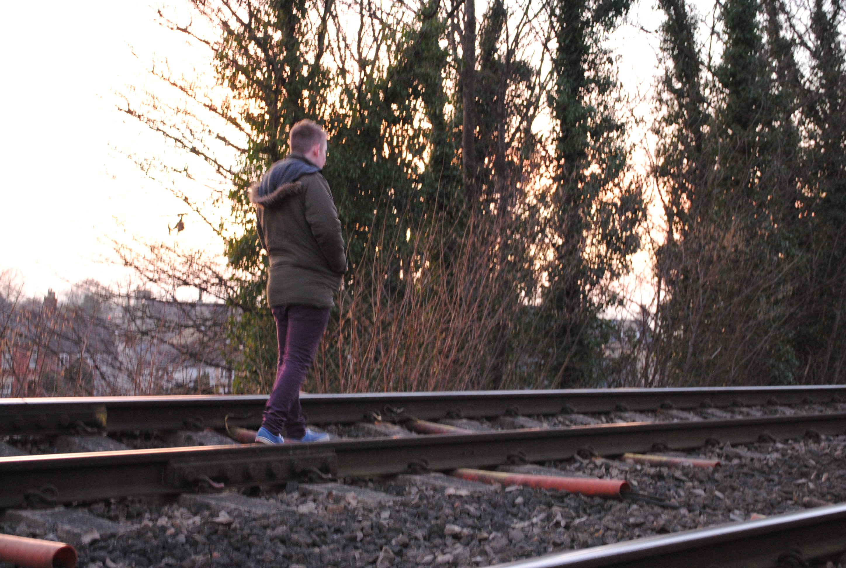
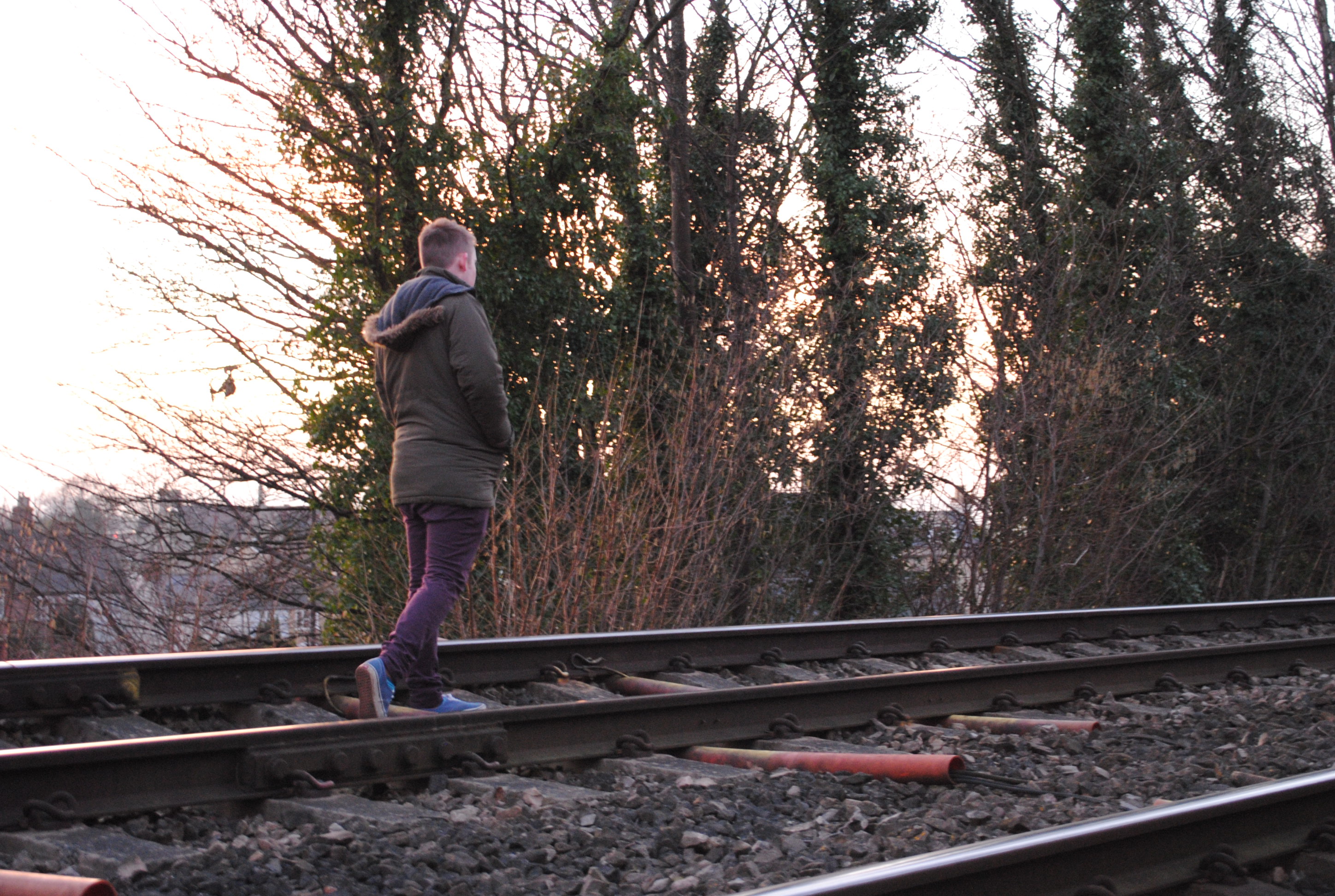
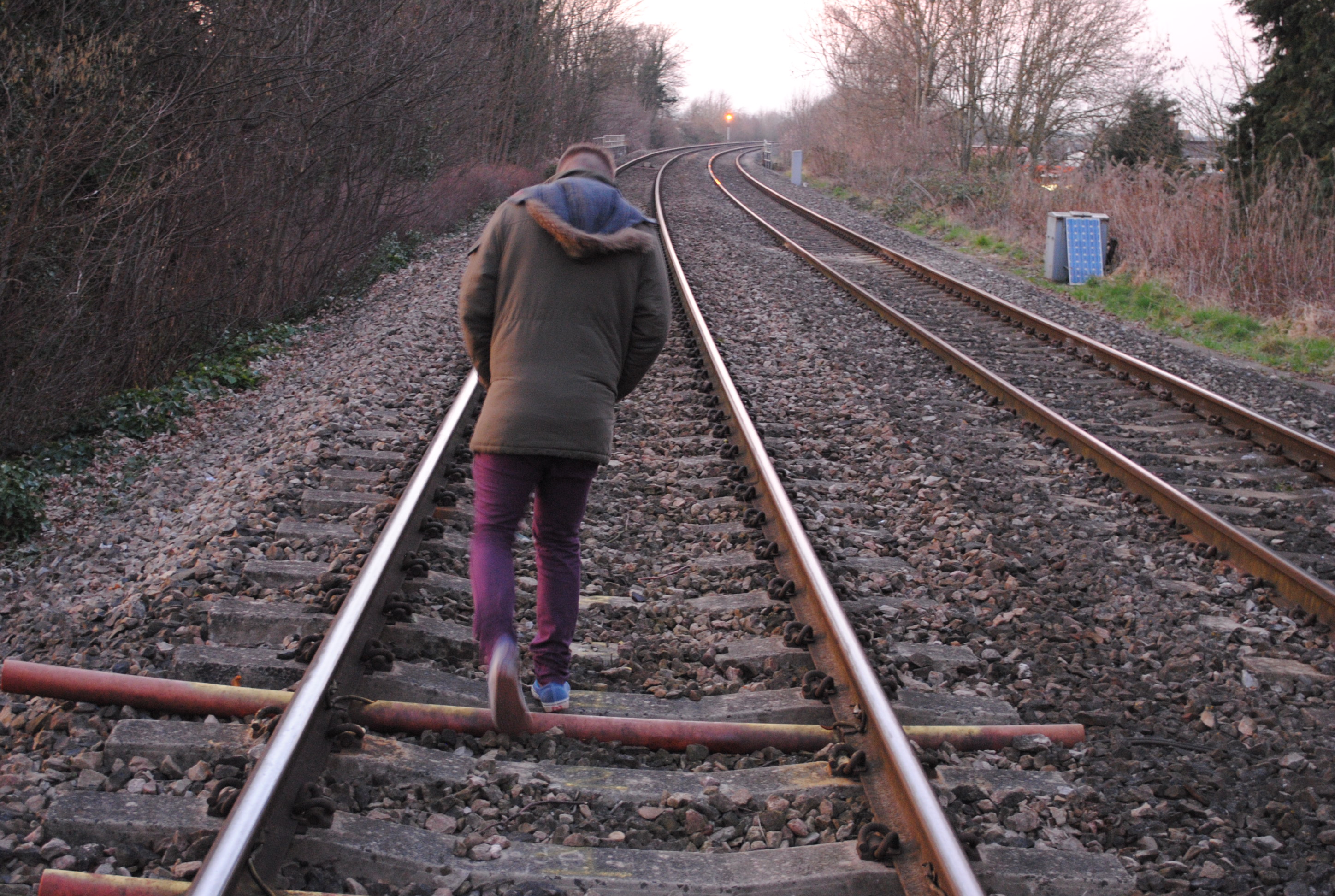
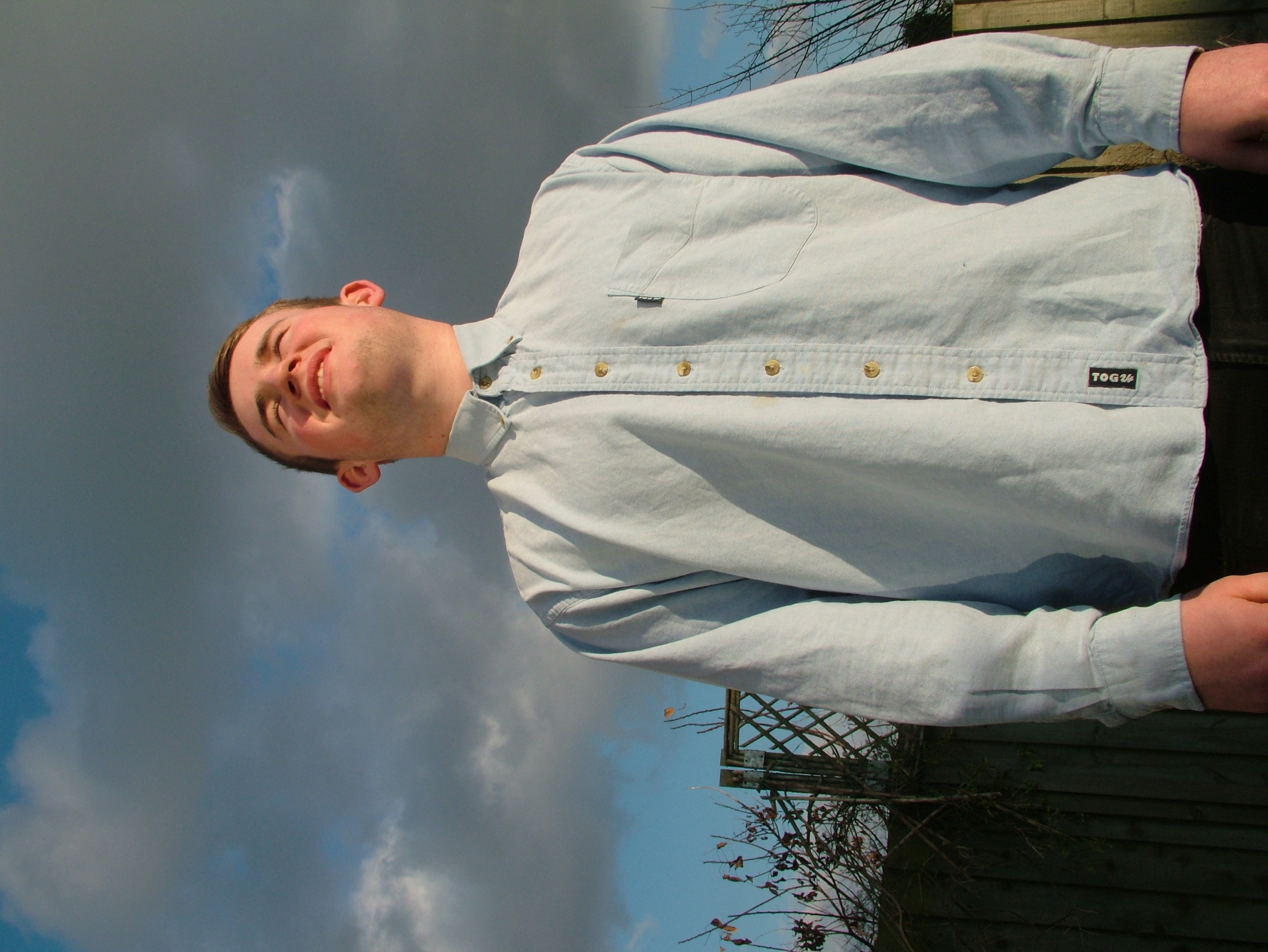
I took my first set of photos in front of a brick wall because again the bricks are a representation of the artist’s hard character. As well as this it is a representation of his urban background, as this is where a younger target audience would live, especially if they are attending a university. I also took some photos on some train tracks, one of which is present on my contents page. I took these images here, again because it was a strong representation of the artist’s character. Also the image on the tracks links in with the main article headed ‘where does he go from here?’ So along with the imagery of the train tracks, the main article suggests that we are going to discover what the next part of the artists life and where he will go from where he is. If you read the article you will discover that the artist has been out of the music industry for quite some time and is just making a comeback with his new album. So I wanted to discuss what he has been up to and what he will do next. Also the double page spread image, although spelling the letter ‘M’ (the first letter of the artists name), can also be seen as a metaphor linking with the article title ‘where does he go from here?’ Because to form the letter ‘M’ you have to jump from one point to the other, like a journey that he has to take.
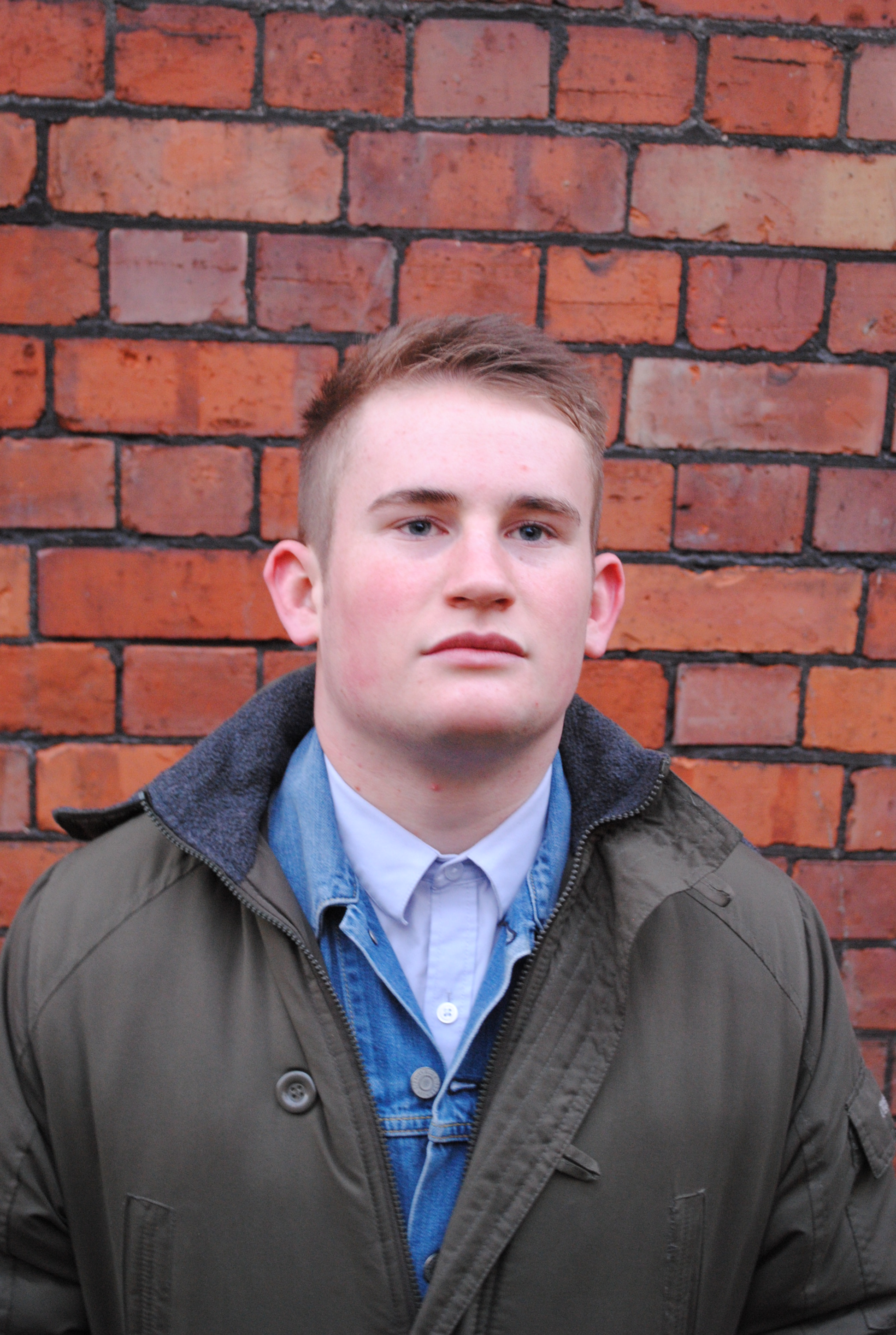
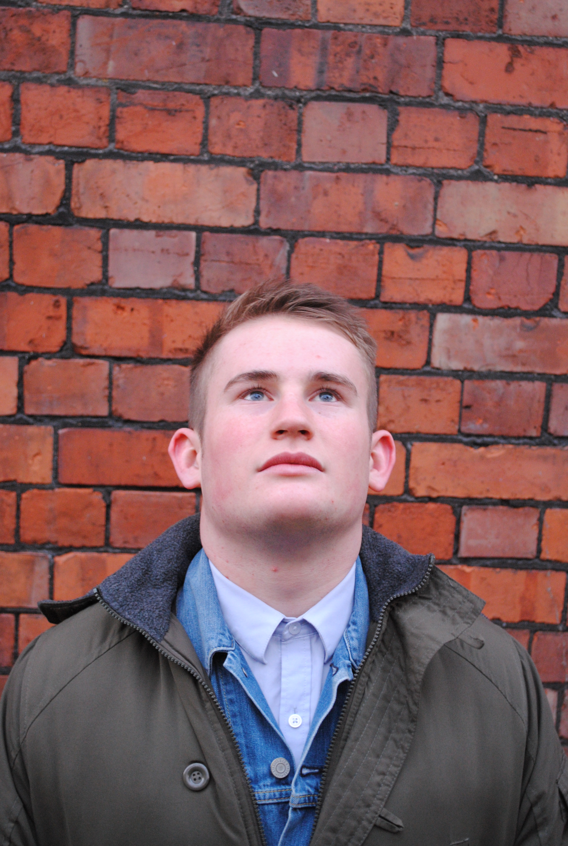


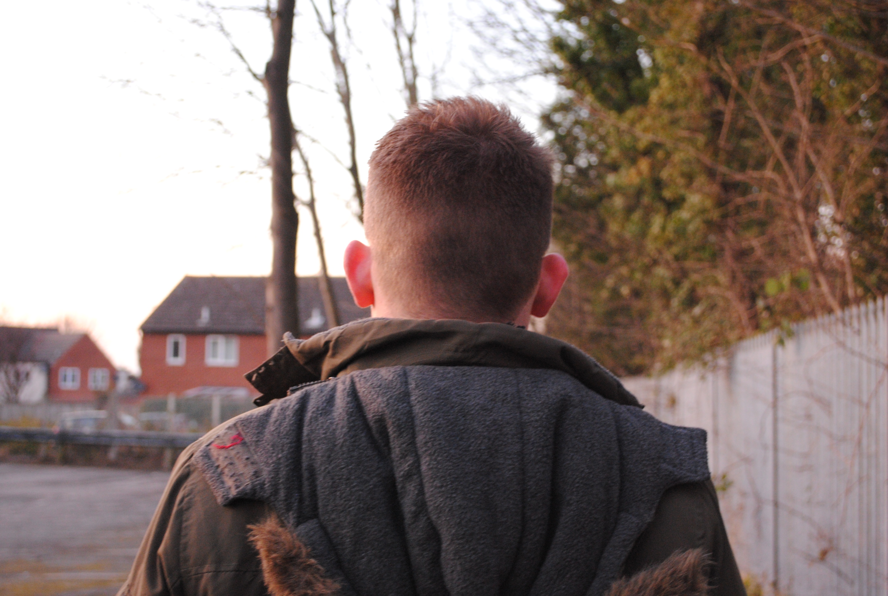


When I took my second set of photos of the artist, because I wasn’t happy with the first set, I took more of a studio approach but tried to still make it look like a natural image. I did this, by making the artist keep a serious face and made him act as if he were about to roll a cigarette. This is to express that the magazine is serious in tone, and also makes the artist look like a serious character, like he isn’t messing around. If I had the artist smiling on the cover it wouldn’t only suggest that he has a soft character and is friendly, but could also completely change the style of magazine. Therefore with my imagery on the front cover, it suggests that this magazine has quite a strong ethos, and also represents that it is a rock genre.


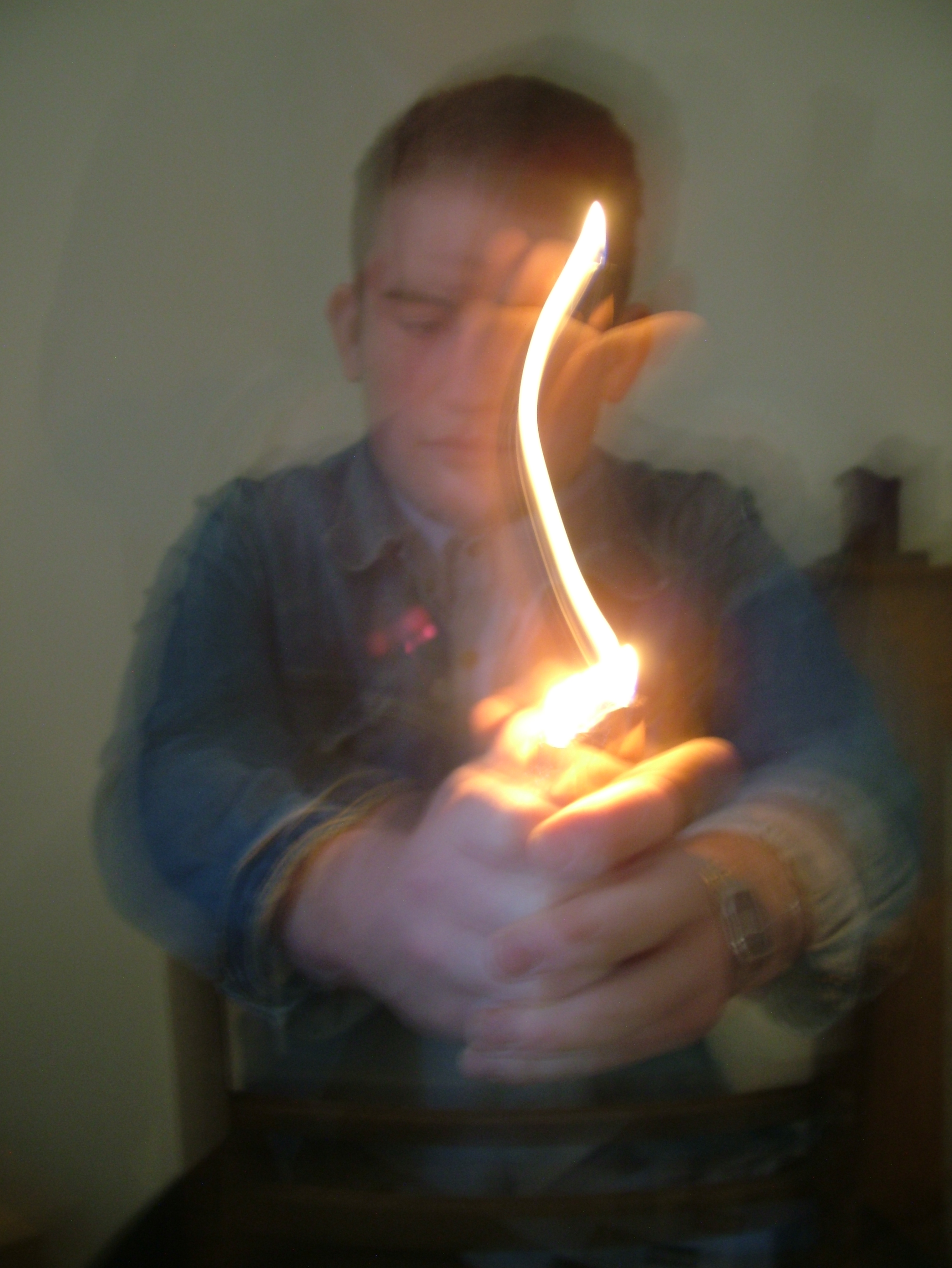


Having done a lot of research into NME magazines and actually subscribing to them, I noticed that they always have a few pages talking about young upcoming bands/artists, and this is what I wanted to include in my design so I left some space down the right hand side of my contents page for this image of my second artist. For the images on the double page spread I wanted to achieve the effect of the letter ‘m’ as the artist moved a lighter in the shape of the letter. I managed to achieve this because I noticed the camera was taking quite a long time to take the full image so I asked him to slowly move it in the shape and after a number of attempts we managed to get it. If I could improve something about these images I would take more time to prepare and think them through. Also I would try and capture some more of the lighter images to make sure the artist in the background was more in focus. However I do feel It works quite well with the blurry face as it suggests that the main focus is on the lighter and draws more attention to it.
I chose to do an interview because I knew it would be a good way to express the personality of my main artist and give the reader a better understanding of the ethos of the magazine. On the contents page I tried to come up with some snappy lines that would evolve around the bands and artists they talk about. The interview will show the artists real side, and will appeal to target audience as it is probably how they speak too. Also the target audience that want to read my magazine will want to know about the actual music, musician, content of lyrics etc, not celebrity gossip or trivial issues, that you would expect to find in a pop magazine, or gossip magazine such as heat or OK, where every petty piece of celebrity gossip is blown out of proportion.
I chose to lay my cover out like this because through researching NME magazines the general style of their magazine covers stuck with me and that’s why my magazine has quite an NME feel to it.

This is also because my target audience is very similar to that of an NME audience therefore the tastes of layout will be very similar.

You can see from my flat plans that I was originally going to use a black and grey image, but having finished the original cover I made, I really wasn’t happy with it therefore took a second lot of photos that I showed earlier on in this evaluation and redesigned the cover. This is because I felt it was too dark and knew the image just didn’t look right, and decided to use a mid-shot. Again with my double page spread I felt the image could be more alternative and imaginative and that’s another reason I decided to take some more images.
I decided to approach my article with the tone and register I did, because I knew my target audience would find it appealing. No rock fan wouldn’t want to read a formal, sophisticated text about a photo shoot that their favourite artist just under took. They want to read it how the artist would say it without any journalists editing, therefore in an informal tone. And that’s why I decided to choose an interview with the artist so I could write it in the tone and register that artist speaks in, giving a strong representation of him as a person as well as an artist. So using slang and swearing in the article is appropriate because my target audience can relate to it, they will tend to be quite rough and rude, not caring about much.
I carefully selected all the fonts on my page by going through all the different fonts available and not just choosing the fonts I liked, but selecting the ones that suited the design of the page best. For the masthead however I selected the fonts that I thought were most indie and alternative, but again at the same time the fonts suited the style and design of the page.

Here you can see that I selected a number of fonts and using that font wrote one letter on the page until I built up a large list of fonts to select from. I then selected the fonts that I thought would be most ideal for an indie magazine and wrote the masthead using those fonts in a list below. Then out of those fonts I selected the font ‘HolidaySpringsBTNQuill’ to be the masthead of the magazine.

After doing that I had to select the colour of the masthead and done this by creating another page where I wrote the masthead down in a number of different colours that again I thought would be most suitable for an indie magazine. As you can see I originally had the idea of using a full stop on the end of the masthead, but when it comes to actually doing the practical work of designing the cover, I thought that it looked a little strange and not in an indie/alternative way. My magazine cover had a strong influence from NME magazines and I think this is evident through the general style of the magazine. This is all down to the fact that the target audience of my magazine is very similar to that of the target audience of NME. When I was thinking of ideas for the promotion bar, I was quite fixed on the idea of using a printed design. So I found an image on the internet, luckily made up of all the letters I needed, and saved it to my personal drive on the computer.

I inserted this image into photo shop and cut out each letter I needed to for the promotion bar. Before I arranged the letters I inserted a black box across the top that would fill in any gaps between the letters. My fonts have quite a vintage, retro look to them. This is because my target audience will be interested in vintage styled things, such as clothes and vinyl. So over all I chose this style of typography because it was strongly linked to the target audience that I was designing for, so they will find these fonts interesting and easy to relate to.

I subverted the codes and conventions necessary for the magazine genre I was designing. But I did not abide the codes and conventions that a magazine should be abiding. This is because I designed an indie/alternative rock magazine therefore wanted to break the codes and conventions to make it more conventional as a Rock magazine. I think angling the text in the way I have done has worked quite well as it allows more of the image to be revealed. However there is quite a lot of white space down the right hand side of the page, but this is not necessarily something I would change as it works quite well with the composition of the page.On the double page spread I have subverted a few codes but placing a large ‘M’ in the middle of the page and placing the kicker in a ‘V’ shape fill the gap of the ‘M’. I done this mainly because I thought it would be interesting and different, and I doing so i have expressed the fact that this is an indie magazine that does break conventions.
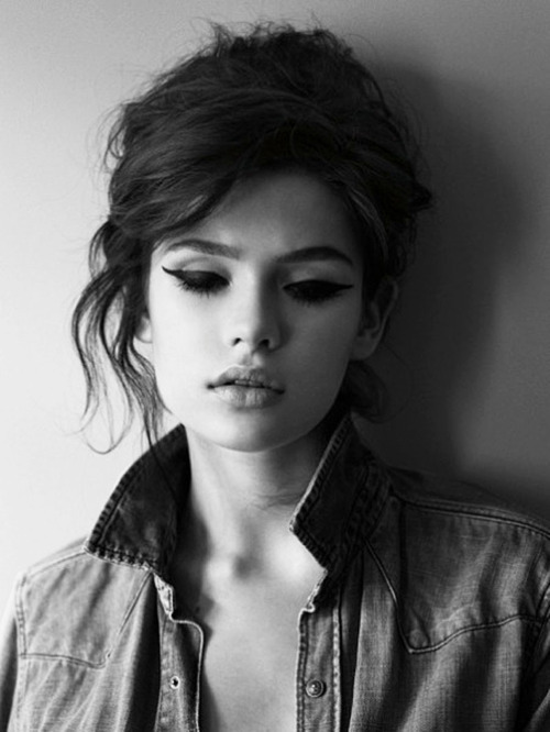
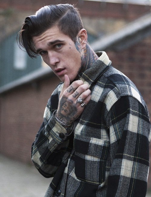
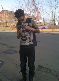
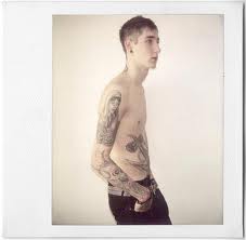
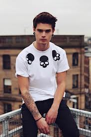
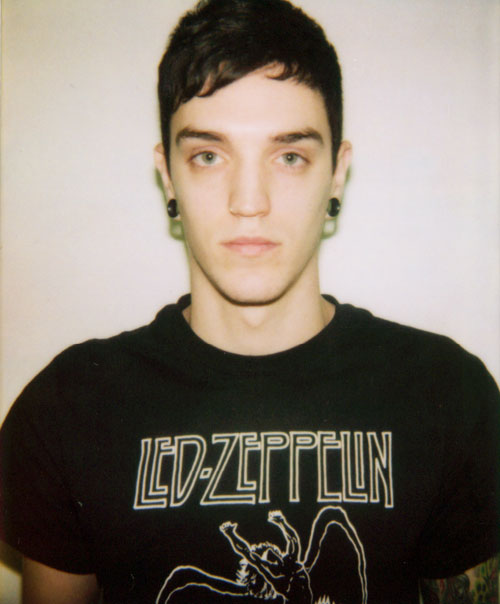
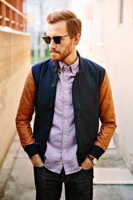
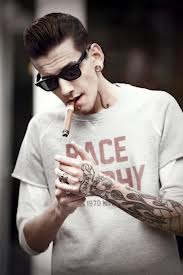
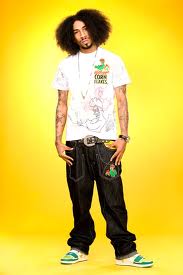
These are some images of the kind of audience I was targeting my magazine at.


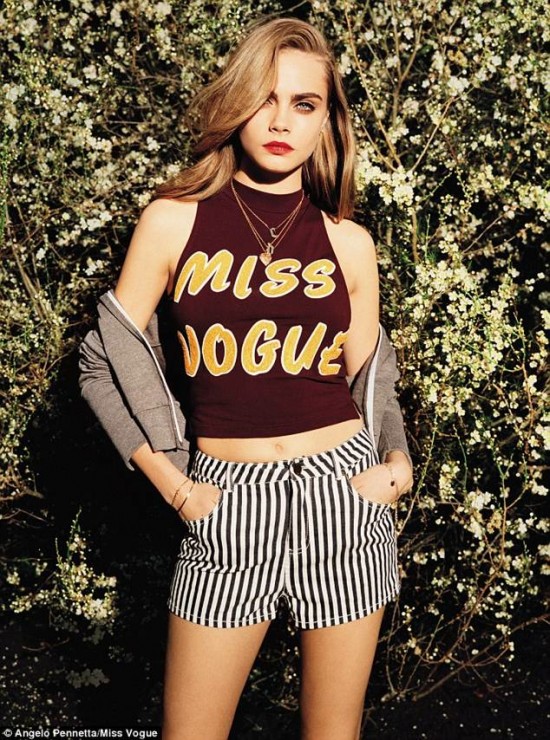
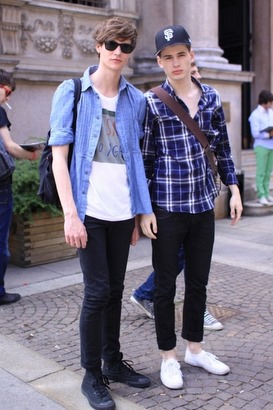


Here are some images of people who are not my target audience.


You can clearly see the difference between the people who I am aiming my magazine at, compared to the people in the second lot of images, who are not my target audience, this is suggested through the totally contrasting styles of clothes.
I have tried to illustrate the target audience buy dressing my artist in a certain way, to suit the target audience and allow them to relate to it more. I have kept the image relatively simple because I wanted it to look more natural as my target would not want a staged studio shot, so I just got him to do anything with the props I gave him and I took pictures. Also the props I used such as tobacco and papers, is something that could potentially be appealing to my target audience as is could be seen as quite a rebellious thing to do.
For the article, I wrote the interview in quite an informal way with a lot of slang and tried to influence a Manchester/northern accent. This is because I know stereo typically that northern people are notoriously aggressive and rude. Therefore I included strong language to make it more appealing to my target audience. My target audience isn’t necessarily of a lower or higher status, but stereotypically they would be of a working class, and would have a level of interest in playing/making music.

My magazine hasn’t really allowed much leeway, in the sense I have based it entirely around rock bands and rock music. Therefore I haven’t really enticed new groups of people to try the magazine, which when marketed wont excel from any of the other magazines of its kind, as it will be targeting the same groups of people. So in a marketing point of view this could be considered as a bit of a flaw. But in a personal view, I feel happy with the end product and wouldn’t want to merge it between contrasting genres like some big magazine companies do. My magazine is however aimed at a massive audience, anyone who appreciates rock music would like this magazine, not only because of the tone it is written in, but also because of the large range of bands it advertises. I have included along the bottom of the cover a list of bands from many sub genres of Rock, ranging from Alt-j, an indie band, to Jimi Hendrix, a rock legend. So in that way I have alienated certain groups, but all along I had planned to create a Rock magazine as I am a massive fan of rock music.
I have displayed my target audience I a much unbiased way, I haven’t tried to make it look like this genre of music is better than any other genre of music (despite the fact it is) you either like it or you don’t. I don’t think anyone should choose what style of music they listen to because of mediated influence, your love and taste for music should be natural and not forced. Every genre has its own fashion related style. Therefore I am obviously going to dress my artist in a particular way to emphasise the fact he is of that genre and group of people.

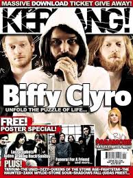
These are two companies that produce magazines very similar to mine. They were both a great influence on my magazine. This has positive and negative effects however, because I know there is clearly a market of there for my style of magazine, but with these two magazine so similar to mine, there would be quite a lot of competition during sales.
My target audience ranges from the age of, 18 to 35 year old males. This is because as well as being a rock magazine it is quite a trendy magazine within its genre, this is suggested through the clothes worn by the artist. And I would not expect anyone over the age of 35 to dress in this way, I’m not saying they shouldn’t, but it is just not expected. The people who listen to this kind of music don’t have to necessarily create their own music; neither do they have to play an instrument. But these are the kind of people who would most likely be interested in this magazine. The people who are in my target audience who do likes ‘band’ music i.e. music that has guitar, drums in etc. often do play instruments as they like to emulate or aspire to be in bands, certainly the NME target audience, which has a high percentage of musicians. My magazine is not aimed at people who are wealthier or more abled than others, if you can afford it and you think it is appealing to you then you could buy it. But stereotypically speaking it would be higher class males, within the age range I have suggested. I would guess that the people interested in this magazine would have some kind of artistic interest, be it design, music or media. My target audience would most likely shop in these clothes stores:
- Topman
- Route one
- Urban outfitters
- asos
- hm
![]()


![]()
when it comes to shoes there are many different kinds but for the majority they would shop in these places :
- schuh
- JD
- Size?
- Office
![]()
![]()

My target audience would probably have quite a vintage look to their fashion style. Vintage clothes are very popular amongst indie and rock groups nowadays and therefore I would also say charity shops are a good source of clothes for my target audience. What does the vintage look say about the ta ? They wouldn’t particularly be well educated or intelligent but a solid interest in music would be expected. Smart phones have become new ways, in which everyone can contact each other, surf the internet and watch videos that would not be possible if it were not for cross technological convergence. And my target audience would most likely have smart phones, to surf the internet and use social networks such as:

![]()
These social networking sites would be used to keep in contact with friends, organise events such as parties. Also to follow their favourite bands and keep up to date with latest albums and tours or gigs that they will be doing.
My target audience wouldn’t watch a lot of TV, as this target audience are quite a social group and like to spend time out at pubs and with friends. But if they did they would probably watch programmes like, South Park, family guy, they would also watch documentaries and music channels. They wouldn’t do a great deal of novel reading, but reading magazines and newspapers would interest them. They would also spend their money on male grooming products such as, hair wax, shaving foam, aftershave etc.
I think my magazine does attract the correct target audience; this is because I have the fashion style represented in my images as well as the typography that would attract my target audience. The clothes are very typical indie/alternative clothes and quite mainstream with in its own style, to get the point across, that this is an indie magazine. Also the tone and register of this magazine is very relevant to the target audience, they can read my article and relate to it because it is of a rude and slangy tone and register. I stated that I wanted my magazine to be aimed at 18-30 year olds and I think I have archived this through not only the tone of the magazine but also the imagery. If you saw this magazine you would think it was for a younger audience as it has a young artist on the cover. Furthermore, in my promotion bar I am promoting a free iTunes voucher. Stereo typically not a lot older generation will have the technology or the knowledge of the technology to use or in some cases (very rare with apple being such an extensive company) the knowledge of what thins even is. So by using an iTunes voucher as my promotion, I have discretely suggested that this magazine is for a younger audience.
I have learnt quite a lot from this experience, compared to the preliminary task of the school magazine, my use of fonts and Photoshop skills have improved a lot. I found that these DTP programmes were very useful in allowing me to archive my final outcome. Without them I would not have been able to create a magazine to the standard I have, whether it be good or bad. I mainly used Photoshop to create my three pages because I used the rulers to keep everything aligned and didn’t really need to use InDesign.
I used Photoshop for all three of my pages, and discovered that it was a very beneficial programme to use as I could enhance/expose my images to change them from their original state to make them more appealing.
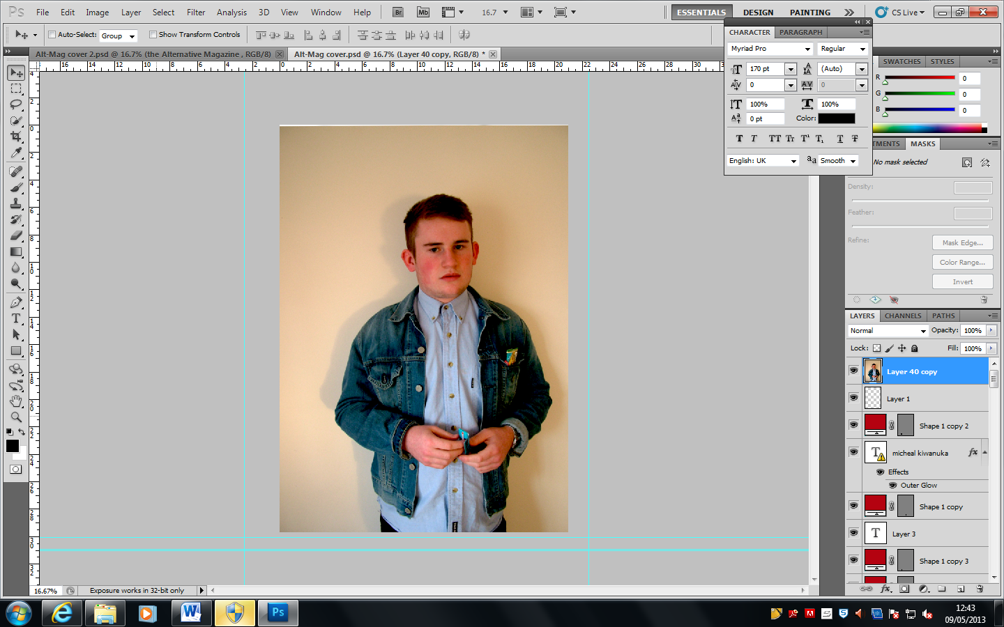
Here I have changed the exposure, the Offset and the Gamma correction of the image to help give the image more depth and tone. I feel this image could be worked with a little more but I think it still works and goes well with the composition with my cover. As well as adjusting the colours of the image I also use the clone tool to correct and blemishes on the artists face.
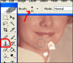
The clone tool is a very useful tool as it allows you to turn average looking images into relatively professional looking images.
For My mast head I done a bit of development into the different style I could use to create it. Again without Photoshop my masthead would look much different as there is such a large amount of fonts to choose from. The font I finally chose is called ‘HolidaySpringsBTNQuill’. I chose this font because as well as it looking quite indie and alternative; I got the feeling that it was quite stylish, therefore appealing to my target audience.
school magazine.
My magazine is directed at keen sport fans that follow rugby. I chose to create this genre of magazine because I enjoy playing rugby and thought I could relate to it well and had a good idea of what I wanted the composition to look like. Obviously along the way I changed a few things from my original idea in order to develop it further and improve it. Right from the start I knew I was going to use a lot of red on the cover, this is because red can be interpreted as a brutal colour, signifying blood, death, danger etc…therefore I knew it would be a good colour to use for rugby, as rugby is a rough and dangerous sport that sheds a lot of blood. For the promotion bar at the top I used a black background with brightly coloured text purely to attract the viewer’s eye as it will make it stand out amongst the other magazines on the shelf. I used orange and yellow, because I didn’t want to use to completely contrasting colour as it could have looked quite bad, and as I used a lot of red I stuck to quite a warm colour theme. I also chose these two colours as some of the magazine I looked at had these colours in the promotion bar and I found it very eye catching and looked quite professional. On both the left and right hand side there are decomposed shapes that I have coloured white. I chose to use white as the main reason I included them were to help the text to stand out more because before they were there it was hard to read the text and the white helps them to stand out. I chose to take this picture with Hendrick looking and pushing through the scrum machine, as it seems like he is trying to break through and grab the reader, and the poles are holding him back from doing so, expressing the aggression of the sport. Also I didn’t want him smiling as that wouldn’t really be a true reflection of the sport and just wouldn’t look right on the front cover of a rugby magazine, as rugby players aren’t dandy and smile when playing, they are very serious and in some cases just out to injure each other. I restricted the headlines and articles to just rugby related as it is a rugby magazine and would want it to be picked up for the sport and not because it has advertised the queens diamond jubilee or something totally unrelated to sport. Also I tried to make this article evolve around the reader, and include articles that will help them to improve their game of rugby. I included the picture of the rugby ball at the top of the page next to the promotion to show the reader what the ball that they would receive at purchase of the magazine looks like. I brought the image of Hendrick in front of the masthead to give the cover more depth and also to help the image stand out more and not look shut away with everything placed on top of it. I think that it worked out ok and not great, because It does cut out the letter ‘G’ completely and makes the masthead quite hard to read if you don’t know what the magazine is called. I decided to include some extra words sure as ‘exclusive’ and ‘plus’ to grab the readers eye and let them know that the magazine would have a lot to offer. I placed these words into shapes and adjusted the shapes using textures and drop shadow to make it stand out and jump at the reader. I also included a sticker effect using drop shadow; this is because in the old days if they forgot to place information on the magazine they used to place stickers on them. Also, again some of the magazines that I looked at prior to making my magazine had this effect on them and I liked the look of it therefore interpreted it into my cover. I wanted this magazine to sound quite enthusiastic and make people actually want to read it, therefore I tried to make it seem interesting and informative. Although rugby is an aggressive sport and I used a lot of red which is a violent colour I didn’t want to make the writing also aggressive as It could make potential buyers less interested as it could jump out at them as being particularly hostile and in some ways intimidating. I tried to keep the text font rather simple throughout and minimise the use of different font styles used, this will help keep the cover neat and not an eye sore to look at. I chose this particular font as it is easy to read and has a bold and solid look to it, portraying the fact its a rugby magazine. It took me quite a while to find a font that best suited the masthead, not to purely express the fact that it’s a rugby magazine, but I wanted to use a font that looked good and complemented the cover. The font I finally settled on has a sturdy look to it with hard edges that also express the superiority of the sport. I have bevelled the edges of the masthead to help it stand out further and give it some texture. I have stuck to the codes and conventions of a magazine cover, as it is a sports magazine and doesn’t need to be indie or alternative as some music magazines would be to express their genre of individuality and rebelliousness against the conventions. I have made some of the articles have larger text to express to the reader that they are more important than others or have bigger stories to reveal therefore grab the readers eye before the smaller text.
In comparison to my school magazine I have produced a much more appealing magazine. I didn’t really understand the software much when I was creating my school magazine, and just have to do this in the moment to see if they would work. And through that process I have learnt how to use Photoshop in a much more controlled way, improving my typography skill, imagery skill and design skill. I feel now that I can produce a magazine at a much higher standard than the school magazine. And this is shown through the progression shown in my music magazine. I have learnt the importance of researching my target audience throughout the planning stage and how much you can benefit from it. It gives you a lot of ideas and helpful information on how to design, and what content to include.

Post preduction survey
Double Page Spread

Contents page

Music magazine cover
